
Trello Apps
In the summer of 2020, I changed teams at Trello and joined the Mobile team. I was thrilled with this opportunity because it was a great mix of technology and design. Technology influences design and design influences technology. With recent developments like folding phones, touch screen laptops, and other mobile technology mediums yet to come, there are endless opportunities for new product-thinking ahead.
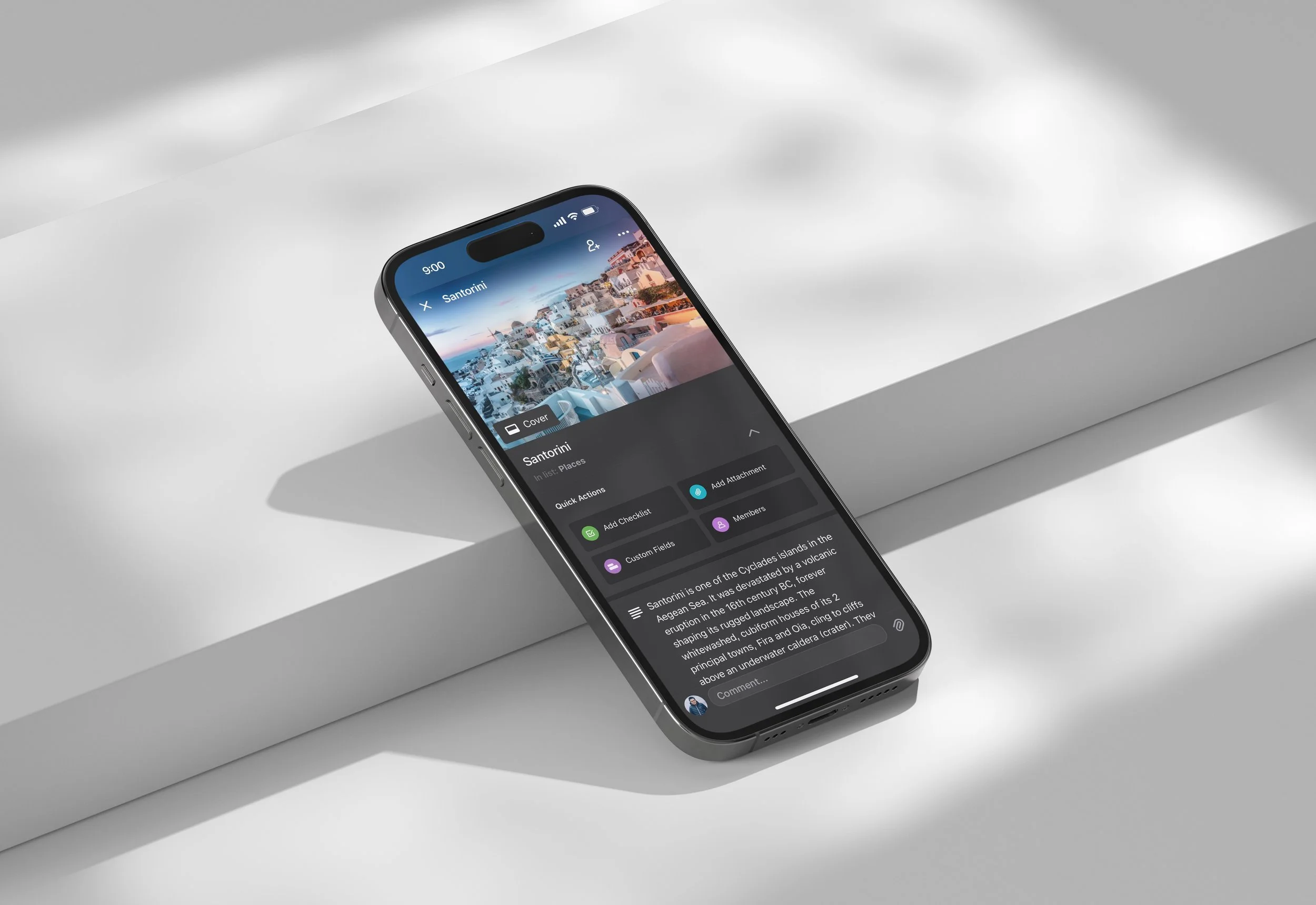
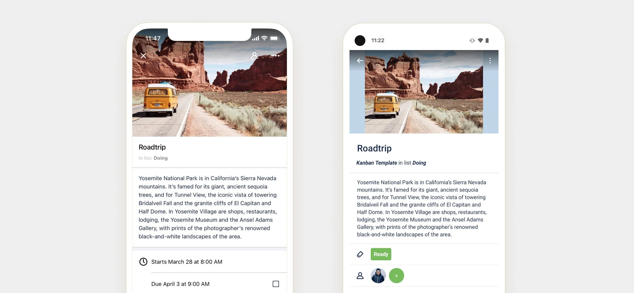
When I joined the mobile team, I was keen to go deep. One of the first opportunities I identified along with the team was the constant feedback from users that the app was clunky, slow, starting to look dated, and overall not an enjoyable app to use. There was a need for platform improvements and optimization of UI/UX. To address these concerns, one of three challenges we took on was the redesign of the second most viewed screen in our apps: the card detail screen, internally known as the Cardback.
Our three goals for the projects were:
Modernization
Improved UX/UI
Future Growth Foundations
1. Modernization:
The Trello app was starting to look dated. To get our first wins for our goal of modernizing the Trello app, I leveraged the most up-to-date design guidelines from each platform. Android and iOS have common design patterns, but they also differ in many ways, making it challenging at first to find common ground across platforms. We iterated a lot by balancing platform excellence, Trello branding, accessibility, delight, and innovative initiatives. Overall, I believe we nailed it.
2. Improved UI/UX
On both platforms, we had significant usability issues. We had several design patterns for input, and to make things worse, some static text headlines ended up looking like inputs. These inconsistencies create confusion and lead to a frustrating experience. Out of both platforms, Android required the biggest design update to bring consistency to the Cardback.
We also wanted to add contextual actions throughout the Cardback to reflect the user's content. For example, for both checklist and attachments, if a user previously wanted to add a checklist or attachment, they would have to navigate all the way back to the top of the card to find the 'add checklist' or 'add attachment' actions. Now, we have contextual headers with contextual actions for each content section of the card, so the user doesn't have to navigate away from the content they are interacting with to build on top of it. Now when a user wants to add a new checklist, they can do it right there from the checklist section. The same applies for other content sections like attachments and custom fields.


3. Future Growth Foundations
Looking ahead, it became evident that having the Trello app looking significantly different on both platforms was not scalable. We needed to find a balance of platform excellence and product consistency. We found common ground by focusing on content hierarchy and information architecture. This involved things like standardizing inputs, interactions, content sections, activity, and layout. Iteration and divergent thinking were key to the success of our launch because we had to be ok to saying no to a lot of things when directions didn't work well for Dark Mode or tablets. The end result is a stable, consistent structure for the Cardback that eliminates guesswork when we, as a product team, dream up new and exciting features for our users.

Other Initiatives…
On iOS we also had the opportunity to update the board menu. Previously, different menu options would have different interactions. Some inputs would bring up a bottom sheet, some a popover, some a slide-over animation. It was inconsistent and made it difficult to discover capabilities locked in the board menu. To resolve these problems, we started with a consistent interaction pattern. Everything is on the bottom sheet for iPhone and Modal for iPad, with consistent slide-in content panels. We improved the information architecture by giving stronger focus to quick actions like staring a board and displaying active Power-Ups and Automations at the default screen so they are just a tap away when opening the board menu, instead of being nested behind a menu link. We also adopted modern iOS 14 patterns for things like input, typography, buttons, colours, and interactions. Every change and careful consideration lead to an optimized experienced that helps users discover and utilize the power of the board menu.

Lastly…
On Android, we updated the board screen to use modern Material Design patterns such as updating colours, typography, elevations, and small details like the right corner radius for cards and lists. All of these small changes make for a significant impact. It's especially important for the app to have a modern, refined board screen because the board is the most viewed screen in the app. All the details matter.
None of these app updates would have been possible without the incredible help and support from both the iOS and Android teams.